Brand: IL GIORNALE
A New Digital Experience
2023
The redesign of Il Giornale’s website focused on redefining its digital identity through a clearer, more accessible, and editorially driven design approach. Starting from an audit of the existing platform, the project addressed issues related to visual complexity, inconsistent image treatments, and limited accessibility. The new design system reduces visual noise, introduces a stronger typographic hierarchy, and adopts a minimal iconography to improve readability across devices. In parallel, the platform was restructured as a modular system of reusable components, allowing journalists to compose pages more efficiently while maintaining consistency and responsive behavior. The result is a more sustainable and accessible digital product, capable of supporting both the editorial workflow and the presence of advertising within a clear and coherent visual framework.
-
FROM DIGITAL TREND TO ACCESSIBILITY
The UX/UI redesign of Il Giornale’s website originated from the need to significantly rethink its digital identity, both visually and functionally. The initial audit of the existing platform revealed a visual language heavily influenced by outdated digital trends, characterized by the excessive use of saturated colors, complex image treatments, and a set of graphic solutions that were difficult to maintain consistently over time.
This approach created several issues. On one hand, it made the platform visually overloaded and less readable; on the other, it introduced operational complexity in the editorial workflow, particularly in a context where images are uploaded daily by the newsroom through fast-paced publishing processes.
During the audit phase and a series of workshops with the editorial team and internal stakeholders, a clear strategic request emerged: bringing the digital product closer to the tone and credibility of the printed newspaper. The goal was therefore to move away from a visual language that felt excessively “digital” and sometimes perceived as too aggressive or visually “acidic”, in favor of a more editorial, authoritative, and readable communication style.
This reflection led to the decision to reintroduce a stronger typographic system and a modular layout structure inspired by the organization of traditional newspaper pages. This approach was not only an aesthetic or branding choice but also a response to concrete technical and operational needs.
A representative example was the use of gradient overlay masks applied to images. These graphical layers were frequently used to enhance visual impact, but in everyday editorial workflows they were often uploaded or applied incorrectly. As a result, they produced problematic color overlaps, reduced text readability, and contrast issues that negatively affected content accessibility.
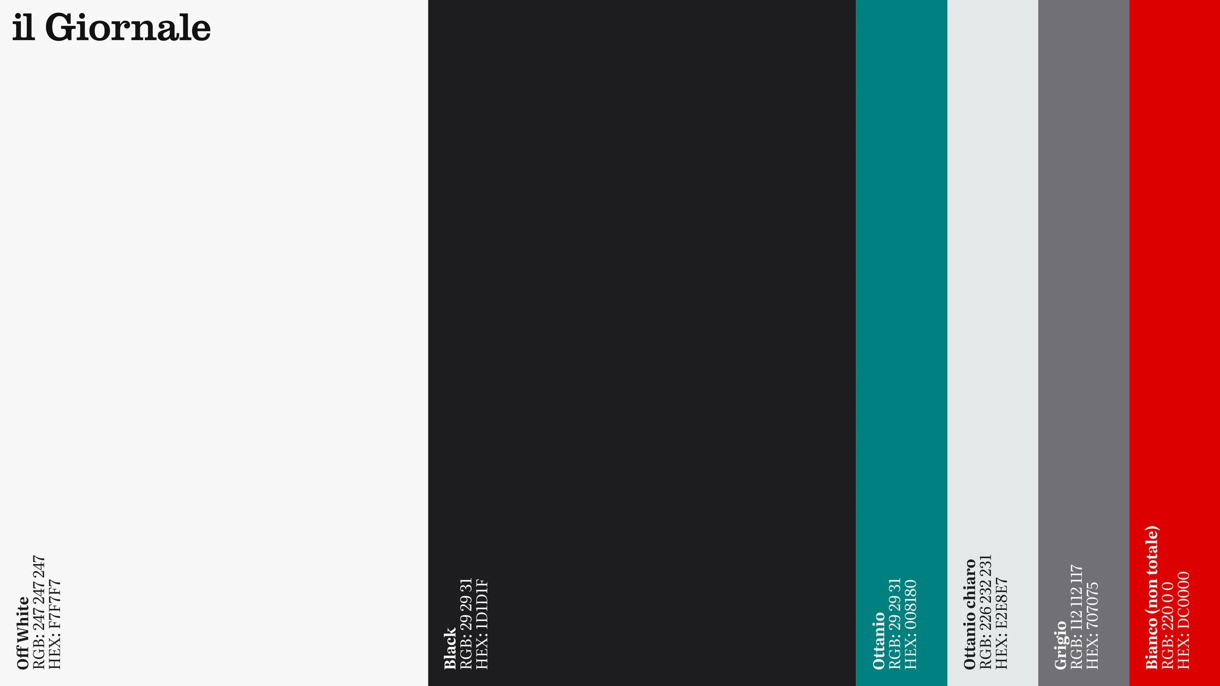
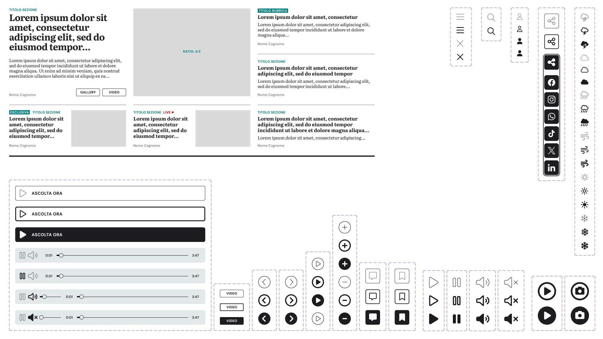
The new design system was therefore conceived to reduce visual complexity and improve accessibility. The brand’s vibrant colors were preserved but used in a more controlled and balanced way. Particular attention was given to the icon system, designed with a clean outline style: minimal, recognizable, and optimized for accessibility and clarity across all screen sizes.
This minimal approach is not simply an alignment with contemporary design trends. Rather, it represents the formalization of a practical design solution. The visual system had to coexist with a structural characteristic of online editorial platforms: the significant presence of advertising.
Skins, display formats, and sponsored content inevitably introduce a wide variety of colors, fonts, and visual languages across the pages. In this context, the website’s design needed to function as a neutral and stable framework capable of maintaining clarity and readability even when external visual elements vary significantly.
A NEW MODULAR SYSTEM
Alongside the visual redesign, the project also involved a deep revision of the editorial architecture and the way content is structured and published.
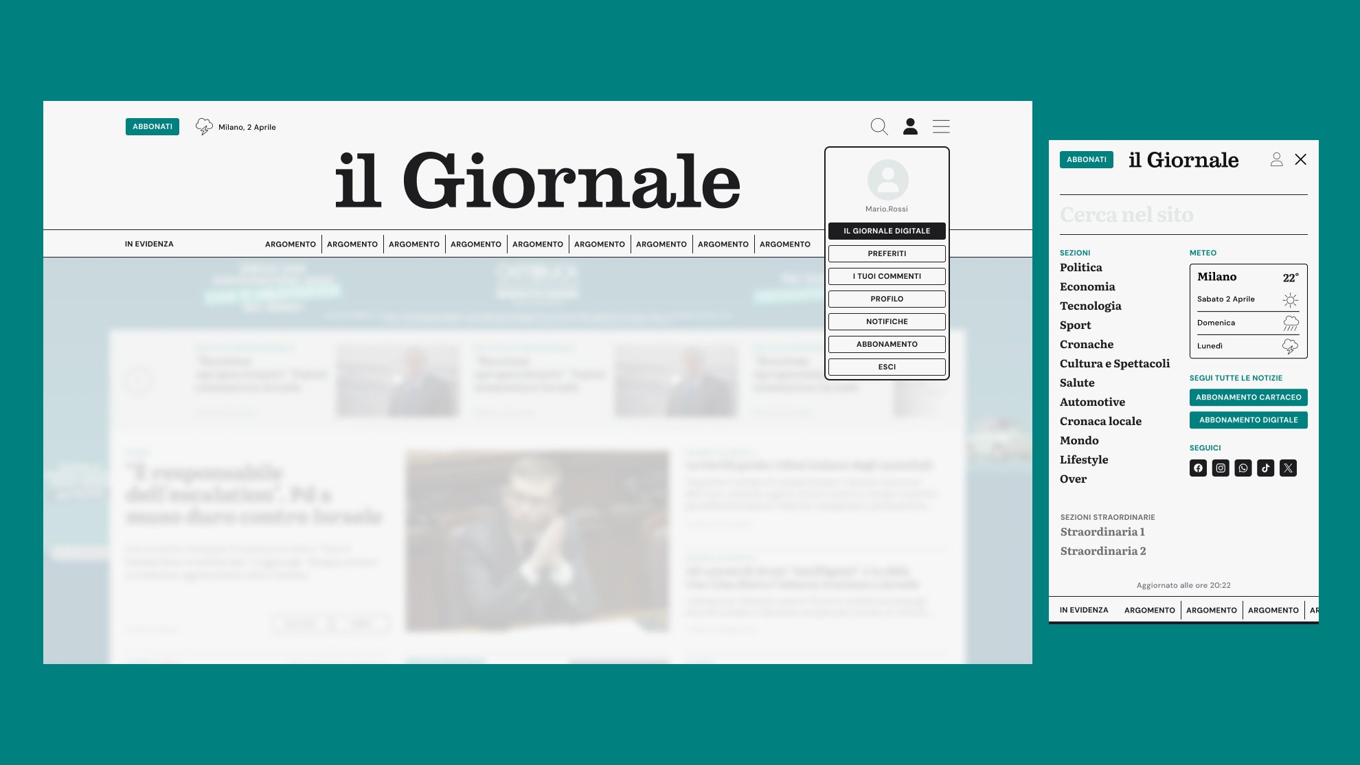
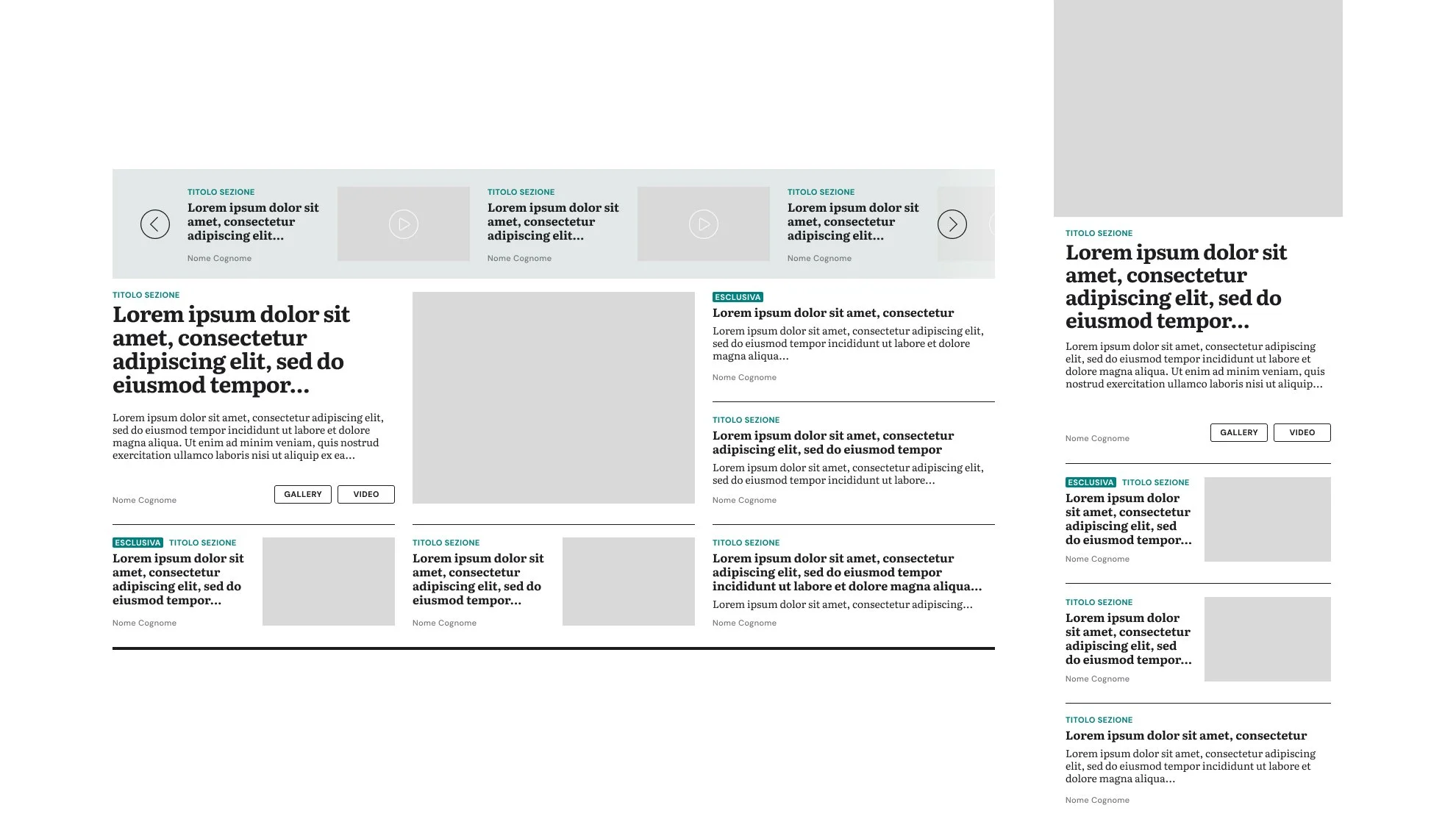
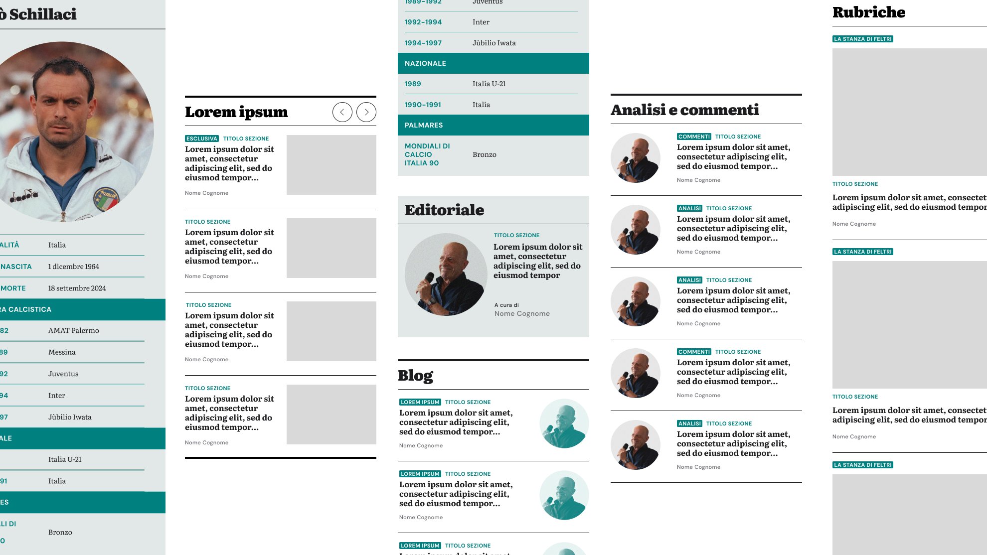
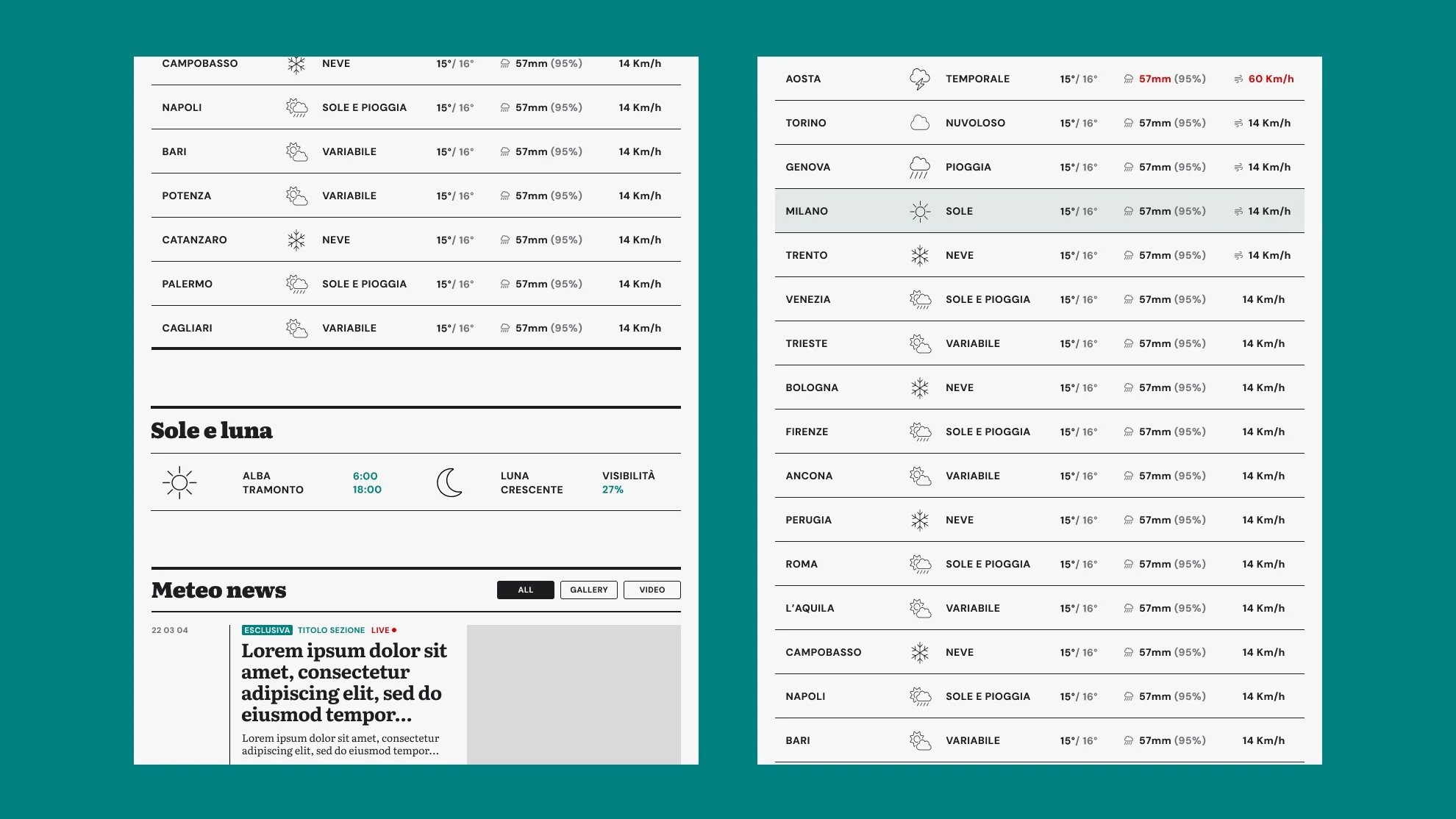
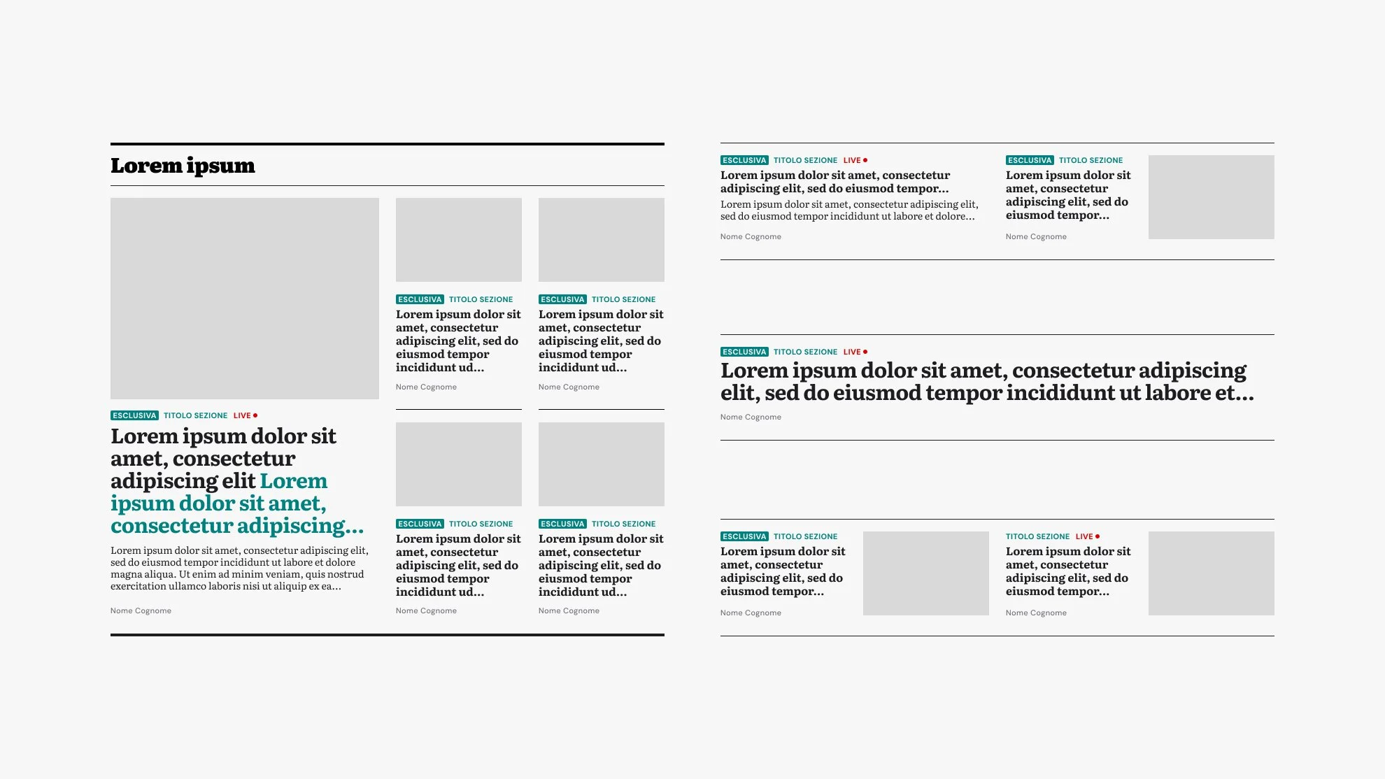
In collaboration with the company’s internal IT department, the website was designed as a modular system based on reusable components. Editorial highlights, snippets, article cards, and content blocks act as building elements that can be combined to create pages.
This modular approach allows journalists to compose pages quickly by selecting the most appropriate modules according to the hierarchy of news content, while ensuring visual consistency and correct responsive behavior across devices. The system also enables greater flexibility when building the homepage or thematic pages without compromising the clarity of the information structure.
The design framework prioritizes editorial rigor and usability. Rather than pursuing visually extravagant or experimental solutions, the system focuses on clarity, visual hierarchy, and reading comfort—essential qualities for a news platform characterized by a high frequency of updates.
Within this framework, all the main page types of the platform were designed, including:
the article page (Leaf page)
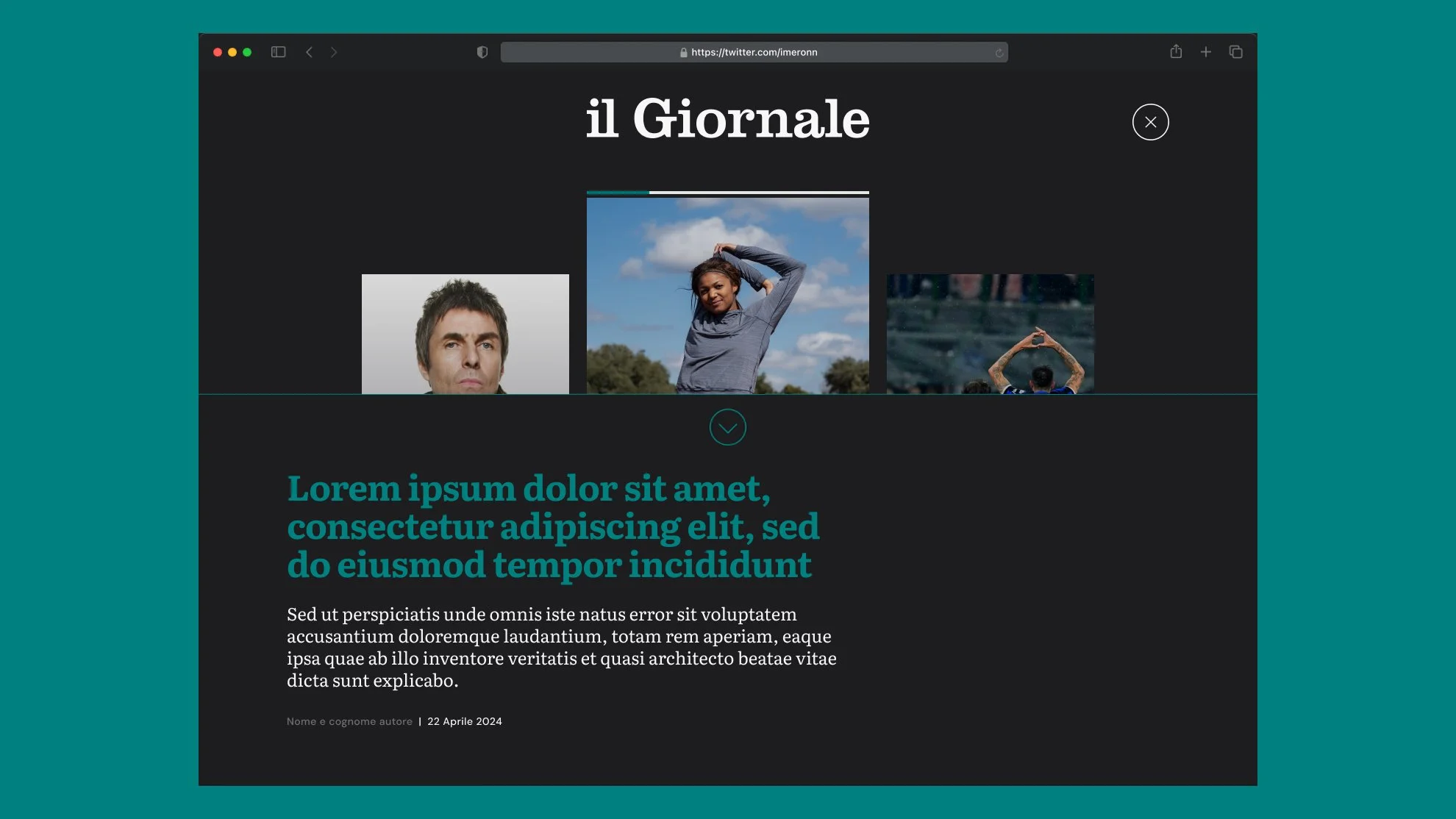
the multimedia article page
taxonomy pages with simple vocabulary structures
rich taxonomy pages, supporting more complex editorial structures
topic and thematic aggregation pages
All pages follow the same design principles and share a consistent structure, ensuring continuity in the navigation experience and helping users easily orient themselves within the platform.
The only major visual variation occurs in the multimedia section. Here, the background shifts from the off-white used throughout the site to a black interface. This choice is not purely aesthetic but intentional: it signals a change of context to users and creates a more immersive environment for video and photographic content.
The overall result is a platform that is more organized, accessible, and sustainable over time: a system designed not only to appear more contemporary, but above all to effectively support the newsroom’s daily workflow and improve the reading experience for users.
-
Agency: Wide design consultancy
Creative Director & Founder: Simone Stucchi -
Brand strategy / Design System / Illustration / Motion design / UX / UI